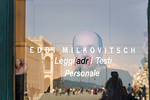
about
Born in Trieste in 1957, where he lives and works.
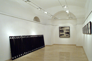
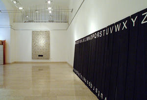
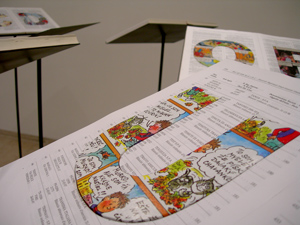
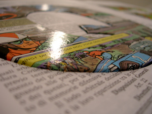
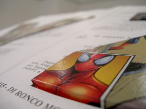
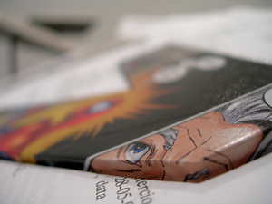
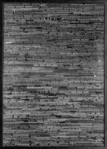
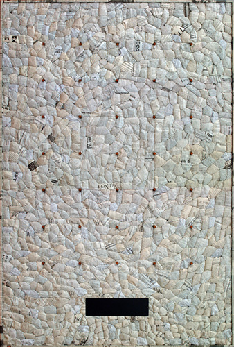
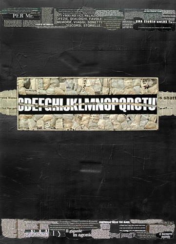
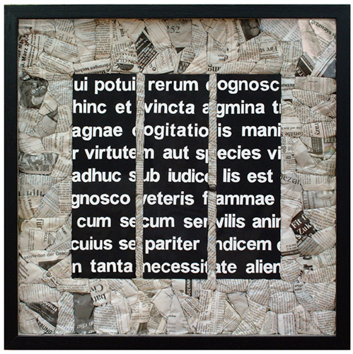
Alphabets, words, overlapping writings, taken from newspapers and magazines. Everything is made out of recycled paper or cardboard. Often the letters stand out with the thickness of the print, in a slightly tridimensional game. Eddi Milkovitsch’s world can be condensed in this brief outline; a passion, a fever caused by letters that forces him to assemble, evocate and enlarge them, emphasizing them in proper context, always made of paper and writings.
Western letterings; his “empire of signs” is linked to classic culture, starting from the Roman square capital, and spreading out to the languages of the western world, not only of latin origin; it does not therefore include what Roland Barthes considers the epitome of the empire of signs, japanese writing, which merges with painting and with life.
A brilliant rationality fills these compositions, where order rules, where accuracy and the sophistication of balance and symmetry are the answer to the artist’s intimate needs, springing from his natural inclination.
These are not academic efforts, the mere result of ordinary schooling; the order, the balance of the compositions and the cleanliness of the material is spontaneous, since Milkovitsch is self-taught, except for a few specific but marginal courses attended, like the one at the Calligraphic club “Inciit”.
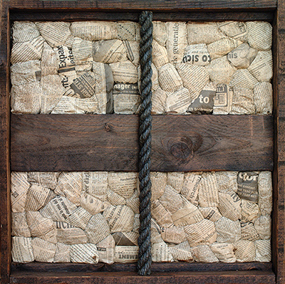
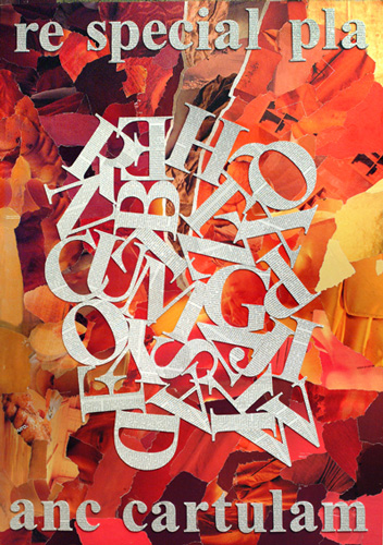
An order tied to an innate aesthetic sense, expressed through structured vocation, along with confident and clean chromatic, compositional and material choices. An happy intuition meets inborn rationality, combining torn newspapers with frugal informal painted interferences, binding the letters that rule the field, the words that consequently derive – coated with paper from magazines – the backgrounds: an interlacement without borders where letters join to form words. Therefore, the significant signs that are at the core of written comunication. The letter/word is the chosen mode of communication, the one that makes history. Milkovitsch’s fascination springs from the semantic potential of letters that aspire to combine into words, words which are the recipients of thoughts, no matter what their importance. Letters scattered like thoughts, the unavoidable testimony of our existence in the world.
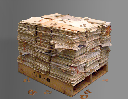
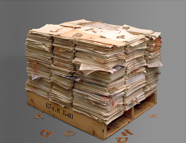
The sheer mass of all paper material produced and consumed leaves heavy tracks. Milkovitsch gathers and restores some, giving them the dignity and the strenght of aesthetic communication.
"Maria Campitelli"
Is it graphics? Sculpture? Painting? Eddi Milkovitsch’s art is a bit of all of this. Harmoniously assembled materials, paper, cardboard, whites, colours, naturals, with a few touches, drops or strokes of colour.
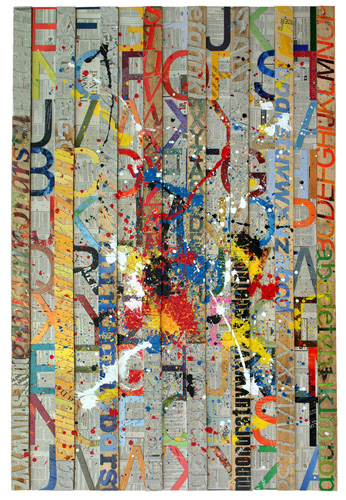
Writings, or better yet, letters, paper alphabets…on paper, traces of ancient signs in new spaces. The Avantgarde of the 20th century teaches us to go “beyond” the surface of the painting, within the space and thickness of the canvas or the sheet of paper, and paste on fragments of everyday life, especially from newspapers, words. We can taste Gris, but also Bauhaus’s lettering, a certain type of Pop Art conjured by Mimmo Rotella. But many other things can also be seen: echoes, reflections, coincidences.
But what we most feel is a declaration of love for the alphabet and for paper, not merely simple signs, but tangible material which express playfulness and symbols, a form of communication, art..no matter what.
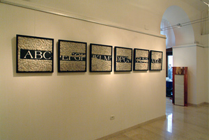
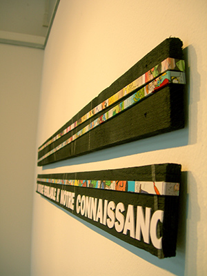
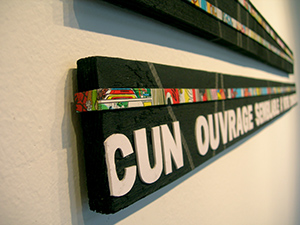
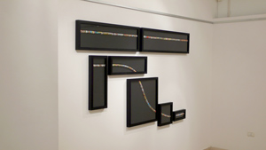
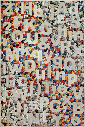
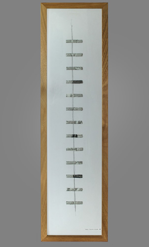
Ancients writings are re-discovered, ancient means of communication going beyond the customary dimension, their litteral meaning: the thin horizontal line that links, like a stroke, a duct, the writing in “Frammenti” (Fragments), breaks up and crashes and then emerges in a crumpled and wavy sea, giving it substance and movement; the entire white alphabet floats iconically on a patchwork of coloured paper balls (“Colour Alphabet”) a modern reminescence of an ancient “carpet page” of insular miniated codes.
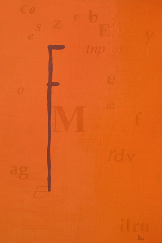
And what about those letters: “R”, “A”, “S”, enclosed, leaning, partially expanded beyond the frame, don’t they remind the ornate initials (decorated manuscripts of with red painted letters) of certain Ottonian codes (like Cividale’s Salterio di Egberto), in their dialogue, their relation between all the visual graphic elements of the page (or the picture, in this case)?
Eddi Milkovitsch has been a diligent student of the “Archive management, paleography and diplomatics“ school of the Record Office of Trieste. From this experience he has absorbed specific influences. He had already attended Nino Perizi’s courses at the Revoltella Museum – and more that his approach to nudes, I believe that Eddi was able to seize and grasp from such a master both the lightness and strenght of origami-like metallic aerial sculptures – and if he now pursues his studies with Cervi Kervischer, the course he took on embossing with the French calligraphist Jean Larcher was certainly very fruitful.
But Milkovitsch is not a calligraphist, he is an artist, who turned paper and letters into the central focus of his digressions and his creations.
He also dabbles into sculpture, using humble materials, used wood and cardboard, reproposed or sometimes covered with different types of paper.
We are reminded of Ceroli’s beginnings, of his letters, of his unprocessed wood, but most of all, and this is what unites them, of the balance, the classic balance (Calvsi) between volume and surface, where classicism lies in the careful selection of shapes, the result of associations and suggestions (not mere slavish quotations) of the everlasting dexterity of doing.
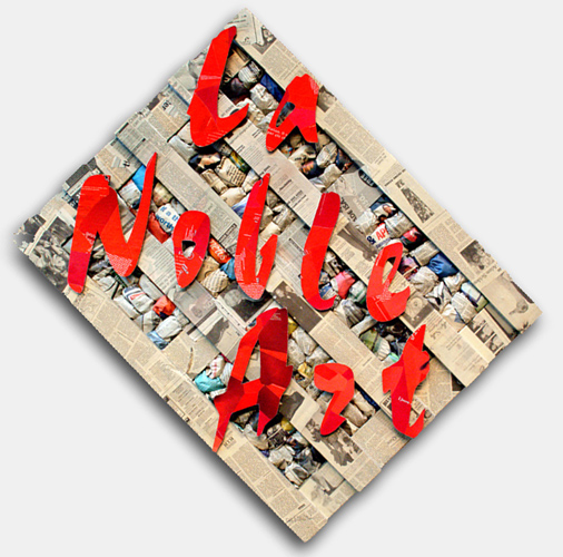
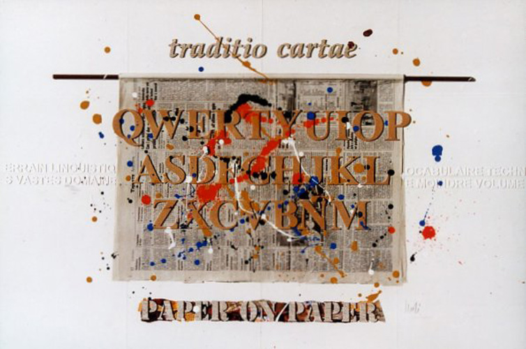
It is sufficient to take a look at “La Noble Art” or “extrema ratio” and “AEQUE”, "Step 1”, “traditio cartae” or the sea of “Senza Titolo”, to grasp, like with Ceroli, the clearness of relations, the interactions of tensions and differences with regard to surfaces, moving towards absolute shapes using the most common of materials.
An entire complex world is hidden in the apparent simplicity of Eddi Milkovitsch’s original paper art works.
"Renata Da Nova Erne"
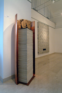
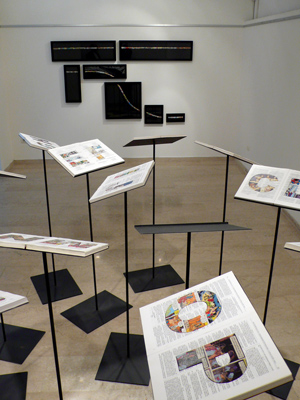
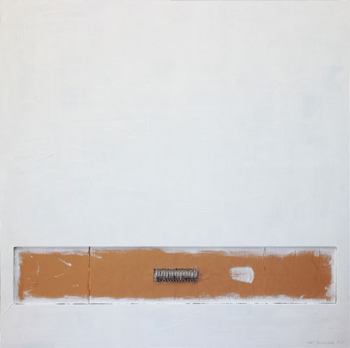
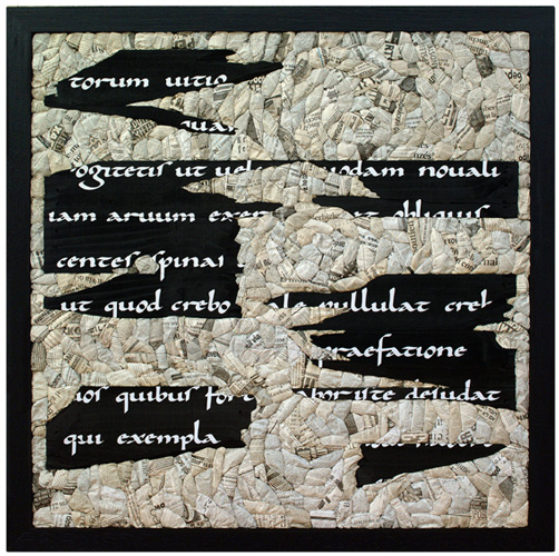
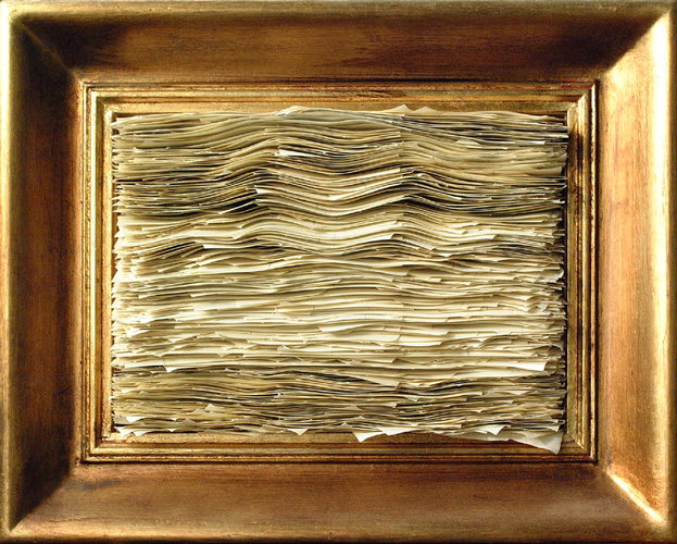
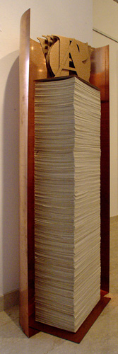
Writing, printed paper and the primary cell – the alphabetical letter - make up Eddi Milkovitsch’s world. He’s thoroughly immersed into it, cutting out any other source of inspiration. Blank paper, sheet upon sheet, waits to be marked with meaningful signs. Sometimes, the piled up sheets (which could bring Arman to mind, although he works within different contexts) are also framed (see “Untitled”) and therefore emphasized, becoming the paradoxical and tangible subject of the canvas, a sort of tribute, a celebration. The letter and its organized expression: the word, have already been the object of analysis during certain periods of modern art history. Futurism comes to mind, in its glorification of the autonomy of words, signs and expressions of contiguous meanings, or, in more recent times, visual poetry, for which the visual symbolism of the written word is taken into consideration like a drawing on a surface, along with its semantic weight.
For Eddi Milkovitsch, however, things are different, he is the child of the new cultural climate of the Third Millennium. The translation of his artistic inspiration into art possesses a solid, rigorous and accurate character.
A love for letters and writing brings the artist’s focus on historical stratifications, he approaches ancient writings, revitalizes Latin, in floating fragments, not so much as to restore contents, but more as a symbolic quotation leading us to the historical foundation of our culture. It is much like expressing deep amazement for the endless extent of the written word, for the different languages taking turns in human history, the evidence of diversified and unrestrainable communication. It is still, in the end, a way of asserting the inescapable necessity of expressing oneself and relating to others. We write to testify, document, daydream… to tell something to our fellow human beings. Communication is thus the foundation.
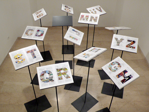
We must also mention the way Milkovitsch highlights and celebrates writing, namely through bi and tridimensional or installative art works. What prevails is geometrical order, a neat definition of forms. With this criteria in mind, he assembles words, letters and blocks of newspaper sheets, accurately and closely set next to each other, like pieces of a puzzle, in order to build peculiar material backdrops in which all the writings of the world seem to converge. “Nihil minus”, this stockpile system of accumulation plays the leading role and swallows all conceivable letters and writings into its articulated structure.
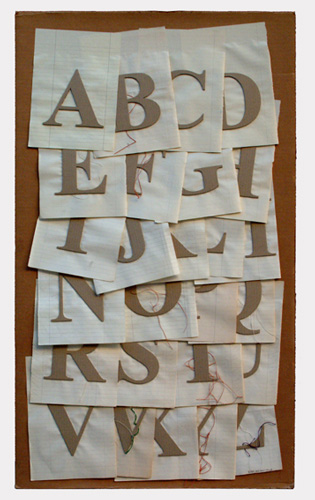
However, the outstanding feature of this creative process remains the alphabet, almost an obsession for the artist: endlessly and orderly reciting all the letters, from A to Z, in different versions, on paper, on wood, using different types of fonts. Ultimately, showcasing the originating fragments which, combined, blossomo into words, writing and ultimately into communication.
"Maria Campitelli"